
You’re Asking Too Many Questions, and It’s Killing Your Conversions
Picture a homeowner standing in a wet basement at 7 p.m. Their water heater just failed. They pull out their phone, find your site, and tap “Request a Quote.” Then they see fourteen fields: name, email, phone, address, square footage, preferred date, budget range, how they heard about you. They close the tab and look […]
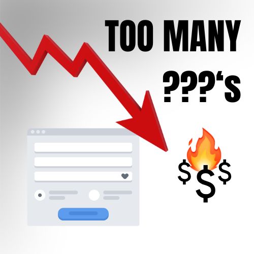
Picture a homeowner standing in a wet basement at 7 p.m. Their water heater just failed. They pull out their phone, find your site, and tap “Request a Quote.” Then they see fourteen fields: name, email, phone, address, square footage, preferred date, budget range, how they heard about you. They close the tab and look up the next plumber on the list.
You never find out that person existed. Your form meant to capture leads just turned one away.
Why businesses build long forms
Most long forms start with good intentions. You want qualified leads. You don’t want to burn an hour on someone who was never going to hire you. You want enough detail to give an accurate quote before you ever pick up the phone. And a lot of the time, the form came with the template or the agency that built the site, and nobody questioned it.
Behind all of it sits one assumption: more information up front means better leads. That assumption deserves a second look.
What every extra question costs you
A homeowner with a broken furnace wants a person on the phone. A questionnaire tells them you’re going to make them work for it.
A few things happen when a form gets long:
- They’re on a phone. Typing on a small screen is slow, and dropdowns, date pickers, and file uploads make it worse.
- They’re stressed. Urgent jobs are the best jobs, and urgent customers have the least patience.
- They don’t trust you yet. Asking for an address and a budget before a single word has been exchanged feels like a lot to hand over to a stranger.
- They can’t answer half of it. Most homeowners don’t know the square footage of their attic or the model number of their furnace.
The worst part is that the damage is invisible. Your inbox only shows the people who finished the form. The ones who left never show up anywhere.
What the numbers say
This isn’t just a hunch. Here are two real examples of what happens when a form gets shorter, and what happens when it gets longer.
Case study 1: 11 fields down to 4
Imaginary Landscape, a Chicago web development firm, tested its own Contact Us form. For two months in late 2007 the site used an 11-question form. In spring 2008 it swapped in a 4-question version and ran it for two months. Site traffic stayed about the same.
The short form submitted 26 times, up from 10 on the long form. The conversion rate went from 5.4% to 11.9%. The company also reviewed what came in on both forms and found the quality of the inquiries was consistent. The questions they removed, like a street address and a fax number, weren’t helping them do anything.
Two honest caveats. This is a small sample, and it was measured in inquiries, not dollars. But it’s a service business measuring the same thing you care about: how many people who reach out actually finish reaching out. (Imaginary Landscape case study, 2008)
Case study 2: The opposite effect with a local contractor
A local contractor had a simple four-question form on their site, and it was working. They averaged about 25 inquiries a month. I’m keeping their name out of this on purpose.
Then they decided to ask for more. They added several fields to better qualify leads before anyone picked up the phone. It seemed like a smart move. The next month, inquiries dropped to 10.
They switched back to the four-question form. The month after that, they were back to their usual 25.
The business and its services stayed the same. The form was the thing that changed. Those extra questions cost them 15 inquiries a month, and every one of those was a homeowner who wanted to hire a contractor.
The goal of a quote form
A quote form is not a project brief. It’s a front door. Its only job is to start a conversation with someone who needs help.
The real qualifying happens on the phone. In two minutes you’ll learn more about the job, the budget, and the timeline than a 14-field form could ever tell you, and you’ll learn it from a person who is already talking to you instead of a person who gave up.
What to ask instead
Here’s the setup I use on most contractor sites. Four fields:
- Name
- Phone number
- ZIP code
That’s all you need. On top of those, I add one hidden field that records which service page the visitor was on when they submitted the form. It costs the customer nothing, and it tells you what they want. Someone who fills out the form on your water heater replacement page doesn’t need to be asked what they need help with.
So with four fields and the page visited, you know who they are, how to reach them, where they are, and what service they’re after. That’s plenty for a rep to call, qualify the job, and book the appointment. Everything else gets answered in the first two minutes of the call, which is where those questions belong.
On mobile, consider putting a tap-to-call button right next to the form. Some people would rather skip typing altogether, and that’s a customer you want.
“But I’ll get junk leads”
This is the most common objection, and it’s reasonable. A few things to keep in mind:
- You can qualify on the call faster than you can read a long form.
- A line like “Serving Youngstown and surrounding areas” next to the form filters out people outside your territory without interrogating anyone.
- In the Imaginary Landscape test, the shorter form didn’t lower the quality of the inquiries.
- You may get a few more tire-kickers. You’ll also get a lot more real customers who would have bounced.
Track your leads for 30 days before you decide the short form isn’t working.
Test it, don’t guess
Shorter isn’t automatically better in every case, so check it against your own numbers. Conversion specialist Michael Aagaard once cut a booking form for an entertainment service from 9 fields to 6 and saw conversions fall 14%. The fields he removed were the interesting ones about the event, and the ones left were the boring contact details. When he put those back and tested the wording instead, conversions rose 19.21%. (Venture Harbour)
The lesson is to cut the questions that feel like paperwork, not the ones that make the customer feel understood. Here’s a quick way to check your own form:
- Fill it out on your phone, and time yourself.
- Count the fields. For each one, ask: “Would I lose this job without this answer?”
- If you have form analytics, look at where people drop off.
- Run the short version against the long one for a few weeks and compare.
Do this today
Cut your quote form to four fields: name, email, phone, and ZIP code. Track which page each submission came from, and leave everything else for the phone call. Watch your lead count for a month.
If you’d like a second set of eyes on your current form, I’ll review it for free and tell you what I’d change. [Get in touch to book a quick review.]